Leverage user habits to make learning new interactions easier ?
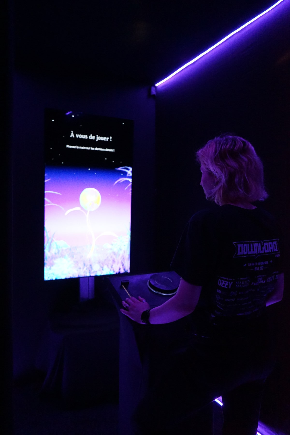
Hanami is an interactive installation that aims to promote cultural places by creating a poetic experience that links museum and parc visitors.
Role
Lead UX Designer
Industry
Cultural
Context
Academic + Freelance
How can we ensure an easy learning curve with semiotics?
Hanami is an interactive installation that offers beginners the opportunity to explore contemporary and generative art by creating their own unique flower through poetry.
We have observed that digital art is not easily accessible to beginners. Generative art is even more difficult for beginners to explore. Our goal is to introduce people to this highly technical and mathematical art form through the language of flowers.
Promote cultural places with interactive installation
This interactive exhibit is comprised of two distinct and autonomous parts that are interdependent to provide the best possible experience.that are interdependent to provide the best possible experience.

The first part, centered on personalization and intimacy,, occurs at a cultural venue, such as the Museum of Contemporary Art in Lyon, France. Here is where the visitor’s unique flower is created. Here, he becomes a creator, sensorially isolated for 5 to 10 minutes.
The scenography creates a universe in which the visitor is immersed with lights, sound, the opacity of the 6m² cabin and the screen presenting the history of his flower and the different choices he has to make.

The second part is more contemplative and about sharing, closer to the Hanami feeling we mentioned earlier in this article. In the park near the museum, you can add your flower to a digital garden of all the flowers created by visitors to the museum. This then becomes a collective, poetic and sharing work, where you’ve got your hands on a seemingly inaccessible art form for a few minutes.
Knowing our users
Our goal with the interactive installation is to fully immerse visitors in the universe, allowing them to become creators and delivering an immersive experience.
As the UX designer, my objective is to ensure that the interface of these installations facilitates rather than hinders the immersive experience we aim to deliver.
So the first step was to learn from our potential users, are they familiar to this type of installation? Do they want one in their city? Are they comfortable with digital interfaces? So I conduct a first quantitative & fundamental research.
Find ideas about the way people will interact in the installation.
As our aim was to showcase generative art in cultural venues, I was able to take the team through several Crazy'8s to bring out the best ideas.

The pleasure of creating a flower : impact & accomplishment
1. Impact
In fact, for each question on this prototype, I had drawn a rudimentary picture of a shoot that grew with each question. We can see here that it’s not necessarily the complexity of the action that gives the feeling of involvement that the testers confirmed, but rather the fact that you take an action that tells you afterwards that “you’ve just had an impact”. These elements will also have an impact on the environment, and from this observation we chose to reflect user’s choices in the scenography, i.e. the lighting, the evolving music, the voice-over, etc.
2. Accomplishment (or IKEA effect)
Completing a series of actions by answering each question, and being rewarded with the animation of a sprout that evolves into a flower, creates a significant sense of satisfaction. The feeling after successfully completing a multi-step recipe is similar — knowing the end from the start does not diminish the sense of accomplishment. This sensation is known as the IKEA effect. The well-dosed effort, which is neither too little nor too much to induce frustration, considerably increases the perceived value.

Scenographic interactions benchmark
You can see that in the red area, we can search for ingredients, product and brand. That is inefficient when someone want to discover new products, as it can be necessary for the company.
Also, on a previous iteration, for customer with diabet, allergies or nutritionnal constraints, we added filters by calories, vegan, allergies. Moreover, product they would like but can't eat or drink, now suggests similar product respectful of their constraints.
Early sketch of the interface
To learn an interface is to forget it.
Now that we were sure that it was fun to create a flower in a guided and even predetermined way, we had to improve the fun in direct interactions. Physical interactions are much more engaging than purely digital ones, on screens for example. That’s one of the reasons why we chose to build a physicial interface.

This is why many cars have physical interactions with distinct shapes and textures placed where they are easily visible without deviating too much attention from the road. After spending a few moments building habits, we can turn on the air conditioning without having to look away from the road. The goal is the same here with storytelling.
Given the configuration of the creation booth and as the screen will be facing them, we want them to avoid looking at their hands to interact. This has several consequences:
- No screens
- No touch screens interactions
- Foster physical memorisation
Which leads us straight to the physical interface! We had to make an interface that was easy to learn, so that it would be forgotten during the average 6-minute experience. Which leaves very little time for learning.
Semiotics: The power of analogies

Some final 3D renders to immerse testers.
You can see that in the red area, we can search for ingredients, product and brand. That is inefficient when someone want to discover new products, as it can be necessary for the company.
Also, on a previous iteration, for customer with diabet, allergies or nutritionnal constraints, we added filters by calories, vegan, allergies. Moreover, product they would like but can't eat or drink, now suggests similar product respectful of their constraints.
Hand-off to developers & documentation
Ensuring intuitive, unobtrusive interaction with testing
I tested the interface at various stages of the project.
• Early guerilla testing - to insure that the pleasure of creating a flower yourself is present.
• Moderated User testing - A few participants were using the prototype to spot eventual issues and improvement.
• Beta Testing - Before and after building the final installation, we tested it with previous and new users in order to detect and correct possible issues due to the, now, physical interface.
High-fidelity test prototype before physical build
Balance between cost and physical iteration.
Throughout the design process, I had to ensure a balance between the cost of physical interface testing (materials, machining, printing, etc.) and the need to progress towards tests closer and closer to the final product.
So it was a balancing act: moving forward and testing as much as possible without losing our budget. In this, UX helped us anticipate as much things as possible.
Thanks for reading!
Sources and additional documentation :
- https://www.hbs.edu/ris/Publication%20Files/11-091.pdf
- https://thedecisionlab.com/biases/ikea-effect
- https://arifriyanto.com/journal/the-joy-of-physical-buttons/
- https://uxdesign.cc/to-the-surprise-of-no-one-physical-buttons-outperform-touchscreens-in-cars-bcd360f7becf
- https://uxdesign.cc/what-is-semiotics-design-and-why-its-crucial-for-ui-4e8cd79f5238
- https://www.diffagency.com/blogs/articles/the-language-of-signs-in-user-experience-design
How to increase retention & convertion on e-commerce website?
Building website and e-commerce platform in agency since 2021. From strategy to iteration and handoff, I work in a systemic & creativite way to find the right designs to reach business goals.
How to improve vending machine accessibility experience?
Designing a mobile app to enhance vending machine experience for people with disabilities or dietary restrictions. A better management for the companies.
UX & natural disasters
For my graduation thesis, I asked myself "Can UX design help manage natural disasters in France and around the world? If yes, how?"


